Title sequences in television have become more than just a way to introduce a show; they often serve as mini-masterpieces that encapsulate the tone, themes, and style of the series.
With the rise of prestige television, title sequences have gained newfound importance, offering creators a chance to set the mood and immerse viewers into the show’s world before the first scene even begins. From animation to live-action, from minimalist designs to elaborate compositions, the best TV title sequences linger in the minds of viewers long after the credits roll.
Over the decades, certain TV title sequences have become iconic, representing the shows they introduce as much as any character or plotline. These sequences not only capture the essence of the series but often become synonymous with the shows themselves. Whether through unforgettable music, striking visuals, or innovative design, the following title sequences have made a lasting impact on the television landscape.
This list counts down 25 of the greatest TV title sequences, each chosen for its ability to captivate, intrigue, and set the stage for the story to come. From classic openings to modern masterpieces, these sequences exemplify the art of television intros.
25. “Halt and Catch Fire” (2014-2017)
- Designer: Elastic
- What Makes It Special: The title sequence for “Halt and Catch Fire” captures the transformative era of the 1980s tech boom with its dynamic and retro-futuristic visuals. Featuring a series of kinetic, glitchy graphics and neon-lit imagery, the sequence visually represents the excitement and innovation of the early computing industry. Accompanied by a pulsating, electronic score by Paul Haslinger, it effectively sets the stage for the show’s exploration of ambition, technology, and the human drive for progress during a pivotal time in tech history.
24. “The Sopranos” (1999-2007)
- Designer: Jamie Dixon and Chase Design Group
- What Makes It Special: The iconic drive through New Jersey, set to the tune of “Woke Up This Morning” by Alabama 3, introduces viewers to Tony Soprano’s world, blending suburban life with the underworld. It’s a powerful, understated sequence that juxtaposes the ordinary with the ominous.
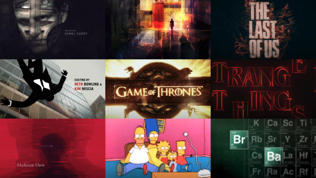
23. “The Last of Us” (2023-)
- Designer: Elastic
- What Makes It Special: The stunning depiction of fungal growth overtaking the landscape, mirrored with Gustavo Santaolalla’s haunting score, perfectly captures the post-apocalyptic tone of the series. It foreshadows the show’s themes of survival and the collapse of civilization.
22. “Game of Thrones” (2011-2019)
- Designer: Elastic
- What Makes It Special: The 3D map of Westeros and Essos, with its clockwork mechanisms and evolving landscapes, provides a dynamic and immersive introduction to the complex world of the series. The sequence is both visually impressive and functionally informative, giving viewers a sense of place and scope.
21. “Stranger Things” (2016-)
- Designer: Imaginary Forces
- What Makes It Special: The nostalgic, 1980s-inspired typography and synth-heavy score by Kyle Dixon and Michael Stein immediately transport viewers to the era. The simplicity of the glowing red letters coming together against a black backdrop effectively sets the mysterious and eerie tone of the series.
20. “Boardwalk Empire” (2010-2014)
- Designer: Imaginary Forces
- What Makes It Special: The image of Nucky Thompson standing by the ocean as bottles of alcohol wash up onshore symbolizes the era of Prohibition and the character’s moral ambiguity. Paired with the haunting “Straight Up and Down” by The Brian Jonestown Massacre, the sequence is both haunting and stylish.
19. “Dexter” (2006-2013)
- Designer: Digital Kitchen
- What Makes It Special: The morning routine of Dexter Morgan, presented in a way that makes the mundane seem sinister, perfectly mirrors the duality of the character’s life as both a serial killer and a blood-spatter analyst. The close-up shots and sound design create an unsettling atmosphere right from the start.
18. “Breaking Bad” (2008-2013)
- Designer: Vince Gilligan and Michael Slovis
- What Makes It Special: The title sequence of Breaking Bad features a stark desert landscape and imagery related to meth production, capturing the show’s themes of transformation and moral decay. Its minimalist design and intense score set a tense, foreboding tone, encapsulating Walter White’s dramatic journey from teacher to drug kingpin.
17. “Narcos” (2015-2017)
- Designer: DK Studios
- What Makes It Special: The use of archival footage, combined with original shots and Rodrigo Amarante’s haunting “Tuyo,” creates a sense of authenticity and tension. The sequence effectively sets the historical and political tone of the series, immersing viewers in the world of drug cartels.
16. “The West Wing” (1999-2006)
- Designer: Imaginary Forces
- What Makes It Special: The patriotic, orchestral score by W.G. Snuffy Walden paired with images of the American flag and the White House, perfectly encapsulates the idealism and gravitas of the series. The sequence invokes a sense of pride and purpose, setting the stage for the political drama to unfold.
15. “Shameless” (2011-2021)
- Designer: Chris Strother and Matt Fray
- What Makes It Special: The chaotic, messy bathroom scenes perfectly reflect the Gallagher family’s dysfunctional life. The sequence is raw, unpolished, and full of energy, setting up the show’s irreverent and gritty tone.
14. “Jessica Jones” (2015-2019)
- Designer: Imaginary Forces
- What Makes It Special: The title sequence for “Jessica Jones” is a dark, stylized visual experience that reflects the show’s gritty, noir-inspired tone. The sequence features a moody color palette and abstract imagery that hint at the psychological and physical trauma faced by the protagonist. The use of a minimalist design combined with the haunting score by Sean Callery immerses viewers into Jessica’s world of urban decay and personal demons.
13. “The Simpsons” (1989-)
- Designer: Matt Groening
- What Makes It Special: The ever-changing couch gag and iconic theme by Danny Elfman make this one of the most recognizable and beloved title sequences in television history. The sequence humorously encapsulates the essence of the Simpson family and Springfield’s quirky residents, remaining fresh and engaging through its countless variations.
12. “Six Feet Under” (2001-2005)
- Designer: Digital Kitchen
- What Makes It Special: The haunting imagery of death and the ethereal score by Thomas Newman set a contemplative, somber tone that perfectly encapsulates the series’ exploration of mortality. The sequence is visually poetic, offering a serene yet unsettling introduction to the show.
11. “Westworld” (2016-2022)
- Designer: Elastic
- What Makes It Special: The intricate, mechanical visuals paired with Ramin Djawadi’s haunting score reflect the show’s themes of artificial intelligence, consciousness, and the blurred line between human and machine. The sequence is both beautiful and ominous, drawing viewers into Westworld’s complex narrative.
10. “Vikings” (2013-2020)
- Designer: J. J. Stelmach
- What Makes It Special: The title sequence for “Vikings” is a powerful introduction to the show’s epic narrative. The sequence combines dramatic, sweeping shots of rugged landscapes with striking imagery of Norse mythology and Viking warrior symbols. The use of emotive, tribal music by composer Trevor Morris enhances the atmosphere, setting a tone of epic adventure and historical drama. The sequence effectively immerses viewers in the gritty, intense world of Viking culture and history, capturing the raw power and mysticism that define the series.
9. “The X-Files” (1993-2018)
- Designer: Mat Beck and Digital Magic
- What Makes It Special: The eerie, iconic theme by Mark Snow and the sequence’s mysterious imagery of paranormal phenomena have made it one of the most memorable title sequences in TV history. It perfectly encapsulates the show’s blend of suspense, mystery, and the supernatural.
8. “The Crown” (2016-)
- Designer: Patrick Clair (Elastic)
- What Makes It Special: The elegant depiction of the construction of the Imperial State Crown, paired with Hans Zimmer’s majestic score, conveys the grandeur and complexity of the British monarchy. The sequence is both beautiful and symbolic, encapsulating the weight of history and tradition.
7. “Mad Men” (2007-2015)
- Designer: Mark Gardner and Steve Fuller
- What Makes It Special: The stylized, falling silhouette of Don Draper set against a backdrop of 1960s advertising imagery perfectly encapsulates the themes of identity, ambition, and the dark undercurrents of the American Dream. The sequence is visually striking and thematically rich, becoming one of the most iconic intros of modern television.
6. “Shōgun” (2024)
- Designer: Elastic
- What Makes It Special: The 2024 adaptation of Shōgun promises a visually stunning and culturally rich title sequence that reflects the epic scale and historical depth of the narrative. Drawing on the grandeur of feudal Japan, the sequence is expected to combine sweeping visuals of the landscape with intricate cultural motifs, all underscored by a powerful and evocative score.
5. “The Twilight Zone” (1959-1964)
- Designer: Rod Serling
- What Makes It Special: The surreal, unsettling visuals paired with Bernard Herrmann’s eerie score make this sequence one of the most iconic in television history. The sequence perfectly sets the tone for the strange and thought-provoking stories to come, with its famous invitation to “enter the Twilight Zone.”
4. “The Wire” (2002-2008)
- Designer: James Veres, Klaus Seitschek, and David Simon
- What Makes It Special: The gritty, documentary-style visuals paired with Tom Waits’ “Way Down in the Hole” set the tone for the show’s realistic portrayal of urban life in Baltimore. The sequence evolves with each season, reflecting the changing focus of the narrative while maintaining the series’ overarching themes.
3. “The Prisoner” (1967-1968)
- Designer: Patrick McGoohan and Bernard Williams
- What Makes It Special: The sequence’s blend of surreal imagery, dramatic music, and cryptic narration sets the stage for the show’s exploration of individuality, freedom, and authority. The sequence is a perfect introduction to the mind-bending, allegorical narrative of the series.
2. “Severance” (2022-)
- Designer: Oliver Latta (Extraweg)
- What Makes It Special: The surreal, unsettling animation where the protagonist is trapped in a Kafkaesque corporate world, perfectly mirrors the show’s themes of identity, control, and corporate dystopia. The sequence is visually striking and immediately immerses viewers in the unsettling atmosphere of Lumon Industries.
1. “True Detective” (Season 1, 2014)
- Designer: Elastic
- What Makes It Special: The haunting, layered images of the Louisiana landscape, combined with The Handsome Family’s “Far From Any Road,” create an eerie, atmospheric introduction to the series’ dark and philosophical exploration of crime and human nature. The sequence sets a somber, introspective tone that mirrors the show’s narrative complexity.
These TV title sequences not only captivate audiences with their visuals and music but also encapsulate the essence of the series they introduce. Whether evoking nostalgia, suspense, or philosophical reflection, each of these sequences has made an indelible mark on television history.